Community forums
Website layout changes
This topic has been locked.
-

- Mazfer
- OFFLINE
- Web Manager
- 562 POSTS
- 50 LIKES
“Just because you aren't paranoid doesn't mean they aren't after you.”
- web techy on DN / www.rsgraphics.fi
15 Mar 2016 22:33 | Last edit: 15 Mar 2016 22:33
Changes made, 15th March 2016
- The menus have been redesigned to offer an even greater viewing experience on mobiles and tablets. Instead of covering the whole width of a mobile, it now slides the content to the right when the menu is revealed.
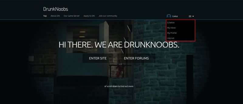
- The menu that was to the top right has been hidden behind a dropdown menu. This one also tells your username if you are logged in, else it will say Welcome Guest.
- Because we now have category specific moderators, the forum code has been altered to check if that user is moderator or not. If user is category moderator it will apply forum moderator colors to said user’s posts in that category only. The user will have the same colors, as a normal user, in any category they are not mod in.
- The Posts column, in a forum category, should now also include the very first post in a topic.
- Due to issues with the login redirect, the login page has been completely redesigned as well as made responsive.
---
Noticed that there are a few other small bugs still, but these are the main changes.
-

- Mercer
- OFFLINE
- Clan Recruitment
- 361 POSTS
- 38 LIKES
-
-

- Mazfer
- OFFLINE
- Web Manager
- 562 POSTS
- 50 LIKES
“Just because you aren't paranoid doesn't mean they aren't after you.”
- web techy on DN / www.rsgraphics.fi
16 Mar 2016 08:49 | Last edit: 16 Mar 2016 08:49
Changes made, 16th March, 2016
- The recall link in your outbox has been given the same color as the delete link.
- Some code changes have been made to the private messaging inbox and outbox. This did slightly impact the style of these two.
- Corrected an issue with specific forum category moderator user link not showing the correct color if said user is moderator in that category.
- The above also concerned if said user is not moderator in a forum category. If this is true, the user will have the same color as the normal user.
- Specific forum category moderators will have the same color as the normal user in the
---- “users online” box in the bottom of the forum.
---- user list
---- user’s forum profile
---- forum statistics
---- and anywhere else where not required
- Banned or blocked users have now been given the same color as normal users. If a user is banned or blocked we have no need to let everyone know.
-

- Livius
- OFFLINE
- 172 POSTS
- 9 LIKES
-
16 Mar 2016 11:11 | Last edit: 16 Mar 2016 11:41
Please login or create an account to view attachments.
-

- Mazfer
- OFFLINE
- Web Manager
- 562 POSTS
- 50 LIKES
“Just because you aren't paranoid doesn't mean they aren't after you.”
- web techy on DN / www.rsgraphics.fi
16 Mar 2016 11:38
The same bug was reported yesterday over Skype. Although after a page refresh it seemed to go away. 
My best guess is that it didnt read the file firing the styling options of the behaviour of the dropdown menu, but during development I didn't face any issues with this solution for said menu.
My best guess is that it didnt read the file firing the styling options of the behaviour of the dropdown menu, but during development I didn't face any issues with this solution for said menu.
-

- Mazfer
- OFFLINE
- Web Manager
- 562 POSTS
- 50 LIKES
“Just because you aren't paranoid doesn't mean they aren't after you.”
- web techy on DN / www.rsgraphics.fi
08 Apr 2016 02:58 | Last edit: 08 Apr 2016 02:59
KarlMariaSeeberg pointed out to me that when arriving on the intro-page of our site it gives the impression that the site and the forums were separated. This was not intended, so the previously "Enter Site" and "Enter forums" have been renamed to "Our News" and "Our Forums".
-

- Mazfer
- OFFLINE
- Web Manager
- 562 POSTS
- 50 LIKES
“Just because you aren't paranoid doesn't mean they aren't after you.”
- web techy on DN / www.rsgraphics.fi
10 Apr 2016 05:28
-

- Mazfer
- OFFLINE
- Web Manager
- 562 POSTS
- 50 LIKES
“Just because you aren't paranoid doesn't mean they aren't after you.”
- web techy on DN / www.rsgraphics.fi
10 Apr 2016 19:44
Updates 10th April 2016:
All of the above mentioned updates have been published.
In addition:
- The intro-page should now open with a video.
- The menu has been re-structured and font changed.
All of the above mentioned updates have been published.
In addition:
- The intro-page should now open with a video.
- The menu has been re-structured and font changed.
-

- karlmariaseeberg
- OFFLINE
- 123 POSTS
- 11 LIKES
-
10 Apr 2016 19:49
the background video is somewhat exhausting to watch ..
also: i still don't get why you keep those two intro buttons, designwise you got the menu to navigate, why introduce that second layer that's obsolet anyway. start with the news blog as your homepage, people are used to navigate on websites using menus., they'll find their way to the forums and everthing the site has to offer.
also: i still don't get why you keep those two intro buttons, designwise you got the menu to navigate, why introduce that second layer that's obsolet anyway. start with the news blog as your homepage, people are used to navigate on websites using menus., they'll find their way to the forums and everthing the site has to offer.


